Author Topic: ATTRACT MODE logo  (Read 43555 times)

verion

  • Global Moderator
  • Hero Member
  • *****
  • Posts: 861
    • View Profile
    • new projects
Re: my take on the ATTRACT MODE logo
« Reply #30 on: May 31, 2015, 01:03:02 PM »
@liquid8d - You've actually made me go to the basement to find my old C64 floppy drive  :D

I've photographed it and turned into texture (2nd image)
I've even added that dirt on edges - that always was the hardest to clean. (3rd image)

It looks cool - but I'm not sure if it looks better. But the previous was too much of pink/orange.
« Last Edit: May 31, 2015, 03:23:02 PM by verion »

liquid8d

  • Global Moderator
  • Sr. Member
  • *****
  • Posts: 442
    • View Profile
Re: my take on the ATTRACT MODE logo
« Reply #31 on: May 31, 2015, 03:28:03 PM »
You have a C64 floppy drive lying around?! :P I like that texture, but not for this logo... I dunno, keep playing with it - I think you are close. My opinion would be like the faded beige from an old newpaper or magazine or something on mode, make mode bigger (maybe even the same size as attract, and throw some thick color borders on it. I love the background as well!

Some other food for thought..


« Last Edit: May 31, 2015, 03:31:00 PM by liquid8d »

verion

  • Global Moderator
  • Hero Member
  • *****
  • Posts: 861
    • View Profile
    • new projects
Re: my take on the ATTRACT MODE logo
« Reply #32 on: May 31, 2015, 03:30:10 PM »
v5
« Last Edit: May 31, 2015, 03:45:15 PM by verion »

verion

  • Global Moderator
  • Hero Member
  • *****
  • Posts: 861
    • View Profile
    • new projects
Re: my take on the ATTRACT MODE logo
« Reply #33 on: May 31, 2015, 04:10:53 PM »
hello 70s

akafox

  • Hero Member
  • *****
  • Posts: 985
    • View Profile
Re: my take on the ATTRACT MODE logo
« Reply #34 on: May 31, 2015, 06:13:13 PM »
Quote
from verion You've actually made me go to the basement to find my old C64 floppy drive  :D

you rock man! I miss mine :( did you know you can hook your commodeor64 to today's internet..and there are websites (they look like old C64 BBSes) to connect to!

Umm I'm looking at the logo not the woman right? lol

getting better man looking good
People want life easy..then complain about it

liquid8d

  • Global Moderator
  • Sr. Member
  • *****
  • Posts: 442
    • View Profile
Re: my take on the ATTRACT MODE logo
« Reply #35 on: May 31, 2015, 09:23:13 PM »
Looks great! Just nitpicking, I'd still like to see a couple variations of maybe different borders or arrangements of the words or something. What do you think about some stylish lines or something behind the lettering? Like a couple varying sizes in a straight line or an arch or offset lines or something?

Just adding some more inspiration or ideas I'm thinking - feel free to do what you will.. really like where you've gone with it!


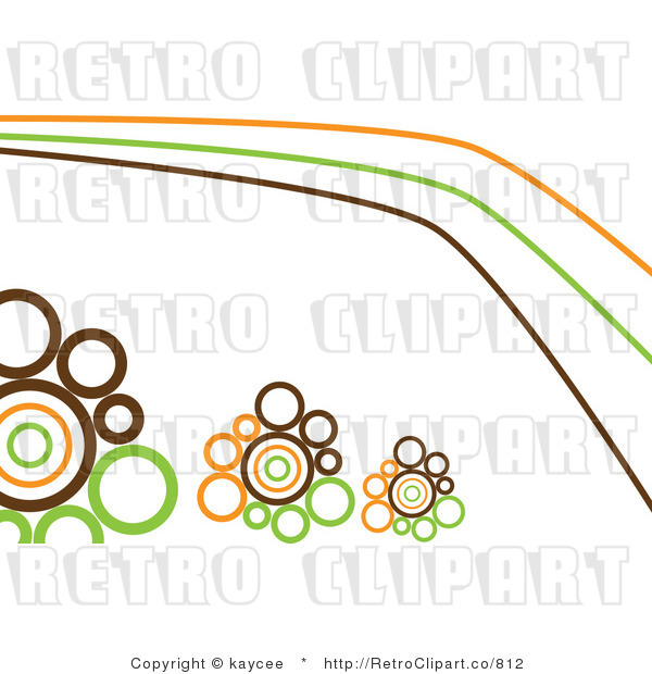
Or I always liked this -I don't know what it's called, but it's used pretty regularly in backgrounds - the small to larger circles in the lines of this pic:


verion

  • Global Moderator
  • Hero Member
  • *****
  • Posts: 861
    • View Profile
    • new projects
Re: my take on the ATTRACT MODE logo
« Reply #36 on: June 01, 2015, 03:13:48 AM »
I think this (v5) variant of logo is finished. We can choose not use it, but more work will be like beating the dead horse.

But we can try different variants.

Below my favourite kind of typography coloring of the era.
I especially like the dark brown-ish inside. I don't know if they were using brown or it is just aged print of black - but this is how I feel it should look like.

verion

  • Global Moderator
  • Hero Member
  • *****
  • Posts: 861
    • View Profile
    • new projects
Re: my take on the ATTRACT MODE logo
« Reply #37 on: June 01, 2015, 03:19:58 AM »
Quote
from akafox  I'm looking at the logo not the woman right?

That girl is mesmerising. She's definitely in Attract Mode. :)

Too bad it's copyrighted foto (not stock) that can't be purchased, so we can't use it for wallpaper or something.  :'(

nitrogen_widget

  • Sr. Member
  • ****
  • Posts: 307
    • View Profile
Re: my take on the ATTRACT MODE logo
« Reply #38 on: June 01, 2015, 10:18:19 AM »
And now something completely different.
It was hard to get to that look - I hope I will remember how to repeat that process :)
Of course it is lacking "mode" for now.

Tell me what you think. Is it better that way?

One word.

SWEET!

omegaman

  • Global Moderator
  • Hero Member
  • *****
  • Posts: 880
    • View Profile
Re: my take on the ATTRACT MODE logo
« Reply #39 on: June 01, 2015, 03:17:42 PM »
Looking good, definitely retro looking. But, you need to ask Raygun what he thinks then send him the final cut.

Does anyone have a hot girlfriend or wife to reenact that pose?  ;) ;) ;) I would ask my spouse but we need to attact people not repel them.  :) Just kidding, of course.  ;)

liquid8d

  • Global Moderator
  • Sr. Member
  • *****
  • Posts: 442
    • View Profile
Re: my take on the ATTRACT MODE logo
« Reply #40 on: June 01, 2015, 10:29:01 PM »
Any of the last three are awesome! Depending on how you planned on doing 'mode' on those - I like the thicker borders with the inside white stroke..

TBH - I think the t-shirt one may still be the best.

Let's get raygun on this and make it official :)

Surely there is a public domain pic of a girl posing somewhere!

akafox

  • Hero Member
  • *****
  • Posts: 985
    • View Profile
Re: my take on the ATTRACT MODE logo
« Reply #41 on: June 02, 2015, 07:08:08 AM »
Does anyone have a hot girlfriend or wife to reenact that pose?  ;) ;) ;) I would ask my spouse but we need to attact people not repel them.  :) Just kidding, of course.  ;)

I take it your spouse doesn't read these posts omega man? LOL

Well...don't get me wrong here..I like the girl(s) and all..however we might want to make the logo not so umm..."manly". Yes emulation might be another "male dominated things" I am sure but I think neutral here night be better.
People want life easy..then complain about it

omegaman

  • Global Moderator
  • Hero Member
  • *****
  • Posts: 880
    • View Profile
Re: my take on the ATTRACT MODE logo
« Reply #42 on: June 02, 2015, 08:05:40 AM »
Fox-
Thank goodness, no. That is just my Jedi mind games at work. ;D  I definitely got the better end of the bargain on that deal.

You bring up a good point. We should probably keep the logo gender neutral as not to offend anyone. I think the last logo would look good even without a background.  How about putting it on a piece of arcade type wood grain for texture?   

omegaman

  • Global Moderator
  • Hero Member
  • *****
  • Posts: 880
    • View Profile
Re: my take on the ATTRACT MODE logo
« Reply #43 on: June 02, 2015, 08:09:09 AM »
How about using the last two with some wood texture. For instance the mode could be done with a wood texture representing what the cabinets of that era were made of. That just overlay on some wood texture.

akafox

  • Hero Member
  • *****
  • Posts: 985
    • View Profile
Re: my take on the ATTRACT MODE logo
« Reply #44 on: June 02, 2015, 02:26:03 PM »
Well not wood..but stick on adhesive wood grain. Just we weren't ready for futuristic grey boxes for our consoles until '85 :P lol

You have a point there. Although using a '70's retro thing is going a little to far back I think. Most people play the old 80's games...they think arcade = 80's (thanks a lot pacman! :P )
People want life easy..then complain about it