Looks great! Just nitpicking, I'd still like to see a couple variations of maybe different borders or arrangements of the words or something. What do you think about some stylish lines or something behind the lettering? Like a couple varying sizes in a straight line or an arch or offset lines or something?
Just adding some more inspiration or ideas I'm thinking - feel free to do what you will.. really like where you've gone with it!


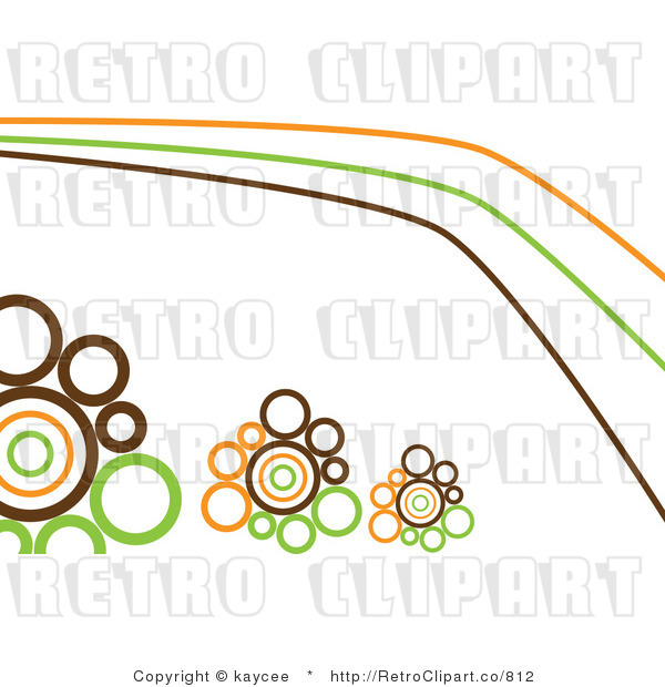
Or I always liked this -I don't know what it's called, but it's used pretty regularly in backgrounds - the small to larger circles in the lines of this pic:
