Author Topic: [download v1.0] FLAT BLUE theme released  (Read 213948 times)

verion

  • Global Moderator
  • Hero Member
  • *****
  • Posts: 863
    • View Profile
    • new projects
[download v1.0] FLAT BLUE theme released
« on: June 18, 2015, 04:16:26 PM »
FLAT BLUE theme v 1.0 released

Finally it is ready to download.
Get it here:
www.ONYXarcade.com/flat_blue


SPECIAL THANKS
to Chris Van Graas (chrisvg) for coding this theme. Without his work and great coding skills this wouldn't be possible.


BUGS
If something is not working - please report it in this thread.
We didn't test it on RPi - please report if this theme works on RPi. To get maximum performance on RPi - do not enable CRT shader effect and do not enable video icons in sidebar (see the options description below)


SCREENSHOTS
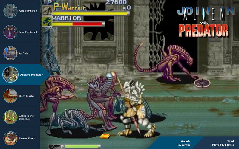
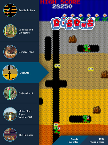


VIDEO
You can see the video of a FLAT BLUE theme working on Blast City arcade cab - HERE


MAIN FEATURES:
  • clean modern design
  • "responsive" layout that auto-adapts to screen aspect
  • works for normal (landscape) and rotated (portrait/tate) screens
  • looks good on hi-res screens and TVs
  • special (auto) settings to look good on low-res CRTs


LAYOUT OPTIONS

Layout rotation
options="None, Right, Flip, Left"
default="None"

description:
Set the rotation of the layout to suit your monitor.
You don't have to use this function if you have rotated monitor AND your graphic card set to ROTATE (i.e. your desktop/console displays normally on rotated display, not sideways). Theme layout will auto-adapt to resolution like 1080x1920.
But this function is useful if you graphic drivers doesn't have rotate function - you can set this to rotate and this will force to display layout in portrait mode regardless of desktop not being rotated. And this is very useful if you are usually using your monitor in landscape mode and only rotating it occasionally to play vertical games.


Menu artwork
options="Snap, Flyer, Icon"
defaulf="Snap"

description:
Set menu panel artwork type (round icon).
Snap is a static game screenshot - you can have video icons instead (see the menu settings below).
"Icon" is reserved for future use - Later I'll create separate thread for this - you can see it in screenshot here


Menu videos
options="Enabled, Disabled"
default=|"Disabled"

description:
Toggle video playback for menu artwork.
If you switch your icon to Snap, you can enable video here.
CAUTION! It's very resource hungry - especially on not-so-fast hardware and with mp4 videos.


Wheel logo
options="Enabled, Disabled"
default="Enabled"

description:
Toggle display of game wheel logos in top-right corner.


Game info 1
options="Year, ROM Name"
default="Year"

description:
Set game information to display in dark blue info panel (top line)


Game info 2
options="Manufacturer, Played Count"
default="Played Count"

description:
Set game information to display in dark blue info panel (bottom line)


Panel shadows
options="Strongest, Strong, Medium, Weak, Weakest, Disabled"
default="Medium"

description:
Left menu sidebar and info panel cast shadows for eye-candy effect. You can adjust effect strength here - because if looks different for different types of screen.


CRT Shader
options="Enabled, Disabled"
default="Disabled"

description:
Enables CRT Shader for snaps. It doesn't add curvature, only graphics effect simulating CRT pixels/phosphor effect.
It helps if your snaps or videos are low-res and displayed on hi-res screen.
CAUTION! It's very resource hungry - especially on not-so-fast hardware and on slow integrated graphic cards.
Disabled for resolutions under 1024x768 - as it is not needed for low res screens and CRTs
You can disable it if your videos/snaps are high-res (like for PC games)


Scanline overlay
options="Strongest, Strong, Medium, Weak, Weakest, Disabled"
default="Weakest"

description:
Set scanline overlay effect strength. Only used if CRT Shader is disabled.
It's a good replacements for CRT shader effect if you don't have enough oomph to run the shader.


=====================================
BELOW YOU CAN FIND ARCHIVED PART OF FIRST POST
=====================================

UPDATE:


FLAT BLUE theme development is back on track!

We started this theme with my mockup graphics and Luke Nukem's code. But since Luke can't find the time to finish the project - it's time for  re-boot.

---

This time chrisvg is doing all the hard work with theme coding - from scratch.

This theme will be:
- truly aspect aware
- working on horizontal screens
- working on vertical screens

Vertical screen support will be universal - it will work with systems set up for vertical screen and with normal (horizontal) setups with screen just rotated 90 or 270 deg.

---

We have a working prototype. You can see the preview video of a FLAT BLUE theme working on Blast City arcade cab - HERE

---

END OF UPDATE


The main goal was to create simple layout with different screen aspects in mind. From 16:9 to 4:3.

---

Additional design goals:

1.
design layout that is usable without additional artwork (wheel, marquee, flyers) except snaps - because it is a really tedious work to collect all artwork if you have a huge library of games. And even if frontend has build-in scrapper (like ATTRACT MODE) the quality of scrapped graphics is not always acceptable.

2.
layout will need only game snaps (screenshots) since game screenshots are widely available or easy to make (press F12)

3.
list icons are simply cropped (masked) snaps

4.
gamelist can be replaced with marquees or wheel graphics

5.
additional game info can be displayed on bredcrumbs-like strip - filter name, year, developer/producer etc.

-------------------

What do you think? Would you like to use layout/theme like that?
« Last Edit: December 26, 2016, 03:43:41 PM by verion »

Luke_Nukem

  • Sr. Member
  • ****
  • Posts: 135
    • View Profile
    • Blogging about Rust lang
Re: FLAT BLUE aspect-aware layout concept
« Reply #1 on: June 18, 2015, 04:52:15 PM »
That's pretty damned nice. Would you like to provide some graphics for us to try out with? It would be really easy for me to do with my current code base, I could probably get a really basic version going within 10 minutes.

I think the left side graphic as one piece. (which we can just crop individual parts out of if need be). And the bottom right graphic. Should be all that is needed to start with.
I won't do animation yet, as that isn't my focus for the moment.

verion

  • Global Moderator
  • Hero Member
  • *****
  • Posts: 863
    • View Profile
    • new projects
Re: FLAT BLUE aspect-aware layout concept
« Reply #2 on: June 18, 2015, 05:04:21 PM »
Sure thing. I'll export that graphics and upload it on dropbox.
I'll export the left sidebar as one piece with cut-outs for snaps.

I was thinking about sidebar and it will need some kind of a script to wrap and truncate game names.
Something like - cut the string just before "(" - to cut off that additional description in mame names. If not - the game names will look messy or the list edited by hand (not good if you have a lot of roms).

----

I've used really nice font "Lato" that is free to download and use (I'll provide the link). Can we load font files from layout folder (instead of font library)?
« Last Edit: June 19, 2015, 04:04:18 AM by verion »

Luke_Nukem

  • Sr. Member
  • ****
  • Posts: 135
    • View Profile
    • Blogging about Rust lang
Re: FLAT BLUE aspect-aware layout concept
« Reply #3 on: June 18, 2015, 05:12:30 PM »
I was just going to use a listBox for it. And then later have animations move the tiles while fading the listBox out, then fade back in as tiles finish moving.

Looks like I might have to generalise my text objects classes a bit more, maybe include some standard animations.

omegaman

  • Global Moderator
  • Hero Member
  • *****
  • Posts: 880
    • View Profile
Re: FLAT BLUE aspect-aware layout concept
« Reply #4 on: June 18, 2015, 07:39:07 PM »
verion-

Looks good man. Do you have an account with emuMovies? If not, I highly recommend it for your snaps, marquees, flyers etc.

liquid8d

  • Global Moderator
  • Sr. Member
  • *****
  • Posts: 442
    • View Profile
Re: FLAT BLUE aspect-aware layout concept
« Reply #5 on: June 18, 2015, 10:01:46 PM »
This is awesome... I can't wait to see some of the layout designs you come up with. You stole one of my ideas I was planing on with the snap in the circles ;)

I'll check this out more when I can get back to working on the aspect thing. Just a quick notice though - for instance in 3x4 it looked like you just cropped it - as the (background) video/snap is cropped. Is that what you would expect to see for "converting" say a 16x9 to 3x4 layout?

verion

  • Global Moderator
  • Hero Member
  • *****
  • Posts: 863
    • View Profile
    • new projects
Re: FLAT BLUE aspect-aware layout concept
« Reply #6 on: June 18, 2015, 10:54:34 PM »
Quote
ust a quick notice though - for instance in 3x4 it looked like you just cropped it - as the (background) video/snap is cropped. Is that what you would expect to see for "converting" say a 16x9 to 3x4 layout?

Well... in this kind of edge to edge design - it looks like I don't really have a better solution. The goal was to reuse the game list in all aspects - just to scale it as a whole object (or surface?)
 
I'm ok with cropping - but I'm strongly against stretching (too much).

Maybe for 3:4 the list could be smaller and have more positions vertically - so the vertical snap can be more visible. For vertical layouts I think there is no need for horizontal snaps/games so it will fit perfectly - with vertical roms/snaps only.

And 16:9 to 3:4 conversion is a really extreme case - I've added this just to check if it is even possible (with good results). As you can see it kinda works, but I think horizontal and vertical setups should be designed separately.

---

I've designed this as an exercise - to see if it is really possible to make it look good in ALL aspects. To see if this all aspect-aware effort really make sense and can be applied in real-word-case scenario.

For sure there is no golden one-size-fits-all solution.
I think the best approach is to choose one of the aspect as the leading one - be it wide or 4:3 - and make it fall-back for other aspects gracefully (with some sacrifices).
This is the best approach for looking-good layouts because if you are trying to make a layout to look equally good in all aspect it will end up looking "average".

But the thing is to make it looking at least "acceptable" in certain aspects and looking great in one of them.
« Last Edit: June 19, 2015, 08:24:09 AM by verion »

verion

  • Global Moderator
  • Hero Member
  • *****
  • Posts: 863
    • View Profile
    • new projects
Re: FLAT BLUE aspect-aware layout concept
« Reply #7 on: June 19, 2015, 02:54:19 AM »
You can download sidebar and info pane graphics using this link:
http://tinyurl.com/FLAT-BLUE-assets-v1

You can download LATO fonts here:
http://www.latofonts.com/download/Lato2OFL.zip

I've used
Lato Bold for selected tile
and
Lato Light for unselected tile

Luke_Nukem

  • Sr. Member
  • ****
  • Posts: 135
    • View Profile
    • Blogging about Rust lang
Re: FLAT BLUE aspect-aware layout concept
« Reply #8 on: June 19, 2015, 03:45:08 AM »
An idea for the movies.

Fit to height but keep ratio and align right. Should work well with horizontal games, not so sure with vertical.

Or,  scale to a width minus the left menu width.

Or,  use horizontal layout for only horizontal games with the first or last method, and so on for vertical.

These graphics are perfect for what I'm working on at the moment, hopefully I'll have something to show tomorrow afternoon (it's 11pm here now) .

Looking forward to seeing everyone else's implementation. Will be cool to compare code and see what solutions to problems were come up with.

verion

  • Global Moderator
  • Hero Member
  • *****
  • Posts: 863
    • View Profile
    • new projects
Re: FLAT BLUE aspect-aware layout concept
« Reply #9 on: June 19, 2015, 04:02:49 AM »
I think this should be like that (this is more-or-less description of what I did in my mockup):

for 16:9 and 16:10
==================

stretch horizontally to screen width minus the left menu width
stretch vertically to screen height

additionally for 16:9 you could scale up left menu a little bit cutting off (let's say) half of first and last game tile
this will make up for additional width


for 4:3
=========================
scale vertically to screen height
set width proportionally (keep aspect)
align left to the menu right edge
part of the snap (from the right) will be not visible - beyond the right edge of the screen.


vertical snaps
========================
I don't have (a good) idea what to do with them in horizontal layouts.

maybe:
scale horizontally to screen width minus the left menu width
keep aspect (or squash it a little vertically)
center vertically - middle of the snap aligned with middle of the screen height.

or:
fit 2 snaps in one row - side by side (or snap plus start/title screen)

verion

  • Global Moderator
  • Hero Member
  • *****
  • Posts: 863
    • View Profile
    • new projects
Re: FLAT BLUE aspect-aware layout concept
« Reply #10 on: June 19, 2015, 04:11:57 AM »
Quote
These graphics are perfect for what I'm working on at the moment

Yea, it will be easier to work with just 2 objects + snaps for now
These graphics are merged with shadows overlays at the edge - if the shadow is to strong/weak in AM let me know - I can change it in a few clicks.

---

I've redone sidebar to be pixel perfect - now distance from snap to snap center is constant across whole sidebar. The Current/selected snap is upscaled 115%

---

If you'll get to the moment when you'll want all elements as separate graphics - just let me know. It is much easier for me to cut it since I have it as separate objects already.

Luke_Nukem

  • Sr. Member
  • ****
  • Posts: 135
    • View Profile
    • Blogging about Rust lang
Re: FLAT BLUE aspect-aware layout concept
« Reply #11 on: June 19, 2015, 04:18:21 AM »
Perhaps supply separate object graphics anyway? I'm kicking around a few ideas and might skip the solid menu altogether.

I disagree with aligning to the menu. Reckon align snaps/video to the right will be better, the menu design makes me feel like it should cover the snaps, hence the shadow. Plus it'll match the bottom right.

verion

  • Global Moderator
  • Hero Member
  • *****
  • Posts: 863
    • View Profile
    • new projects
Re: FLAT BLUE aspect-aware layout concept
« Reply #12 on: June 19, 2015, 04:20:12 AM »
Quote
the menu design makes me feel like it should cover the snaps

Yea, you are absolutely right - it makes more sense.

---

I'll uploaded sidebar elements as separate objects.
The sidebar game tile (the dark one) starts with even darker divider line (on top of it). So you have to nudge first tile a little bit up to hide that divider.
« Last Edit: June 19, 2015, 08:18:18 AM by verion »

verion

  • Global Moderator
  • Hero Member
  • *****
  • Posts: 863
    • View Profile
    • new projects
Re: FLAT BLUE aspect-aware layout concept
« Reply #13 on: June 19, 2015, 06:09:37 AM »
Quote
omegaman: Do you have an account with emuMovies? If not, I highly recommend it for your snaps, marquees, flyers etc.

I'm aware of that.
But IIRC there is a (rather steep) fee of 90$ to download movies. Well... it's not that much if you have thousands of games for various emulators - but I've restricted my game selection to about 150 titles, so the deal is not that sweet. Plus they are not providing any preview or anything so It's hard to decide if it is worth it.

verion

  • Global Moderator
  • Hero Member
  • *****
  • Posts: 863
    • View Profile
    • new projects
Re: FLAT BLUE aspect-aware layout concept
« Reply #14 on: June 19, 2015, 08:39:33 AM »
This is the 3:4 concept revision I was talking about earlier.

Sidebar is scaled down to 75% and game list expanded from 7 to 9
Snap is little squashed 90% horizontal and 100% vertical.
Snap ends just about when the left edge of text is.